Quick answer: How to interpret a Q‑Q plot
- If points lie close to the straight reference line, your sample distribution matches the theoretical distribution.
- S‑shaped curves suggest lighter or heavier tails than normal.
- Concave/convex “banana” shapes suggest skew (right or left).
- Systematic departures at the ends indicate tail issues; scattered deviations in the middle can indicate outliers.
Many powerful statistical tools are designed for data that follows a normal distribution. However, real-world data rarely fits this perfect model. This is where a Quantile-Quantile (Q-Q) plot becomes an essential graphical tool in a data analyst's arsenal.

It helps us determine if our data is "close enough" to a theoretical distribution, like the normal distribution, to proceed with our analysis confidently. This guide will walk you through what Q-Q plots are, how to create them in R, and, most importantly, how to interpret what they're telling you about your data.
For a deeper foundation in these ideas, explore Learning Tree’s Fundamentals of Statistics for Data Science.
What is a Q-Q Plot?
A Q-Q plot is a graphical method used to compare two probability distributions by plotting their quantiles against each other. In most data analysis scenarios, you will use a specific type of Q-Q plot called a probability plot. A probability plot compares the quantiles of your dataset against the quantiles of a theoretical distribution. This visual check is crucial for verifying assumptions before applying many statistical models.
Understanding quantiles is key to understanding Q-Q plots. Quantiles are points that divide a dataset into equal-sized, continuous intervals. For example, you are likely familiar with quartiles, which divide data into four equal parts. When we plot the quantiles from our sample data against the theoretical quantiles of a distribution like the normal distribution, we can visually assess how well the two match up. A straight-line relationship suggests a strong match, while deviations from the line reveal important characteristics about our data's distribution.
If you want to build stronger visualization skills alongside this technique, consider our Data Visualization with Python Training.
Checking for Normality with qqnorm()
One of the most common applications of a Q-Q plot is to test whether a dataset is approximately normally distributed. The R programming language makes this incredibly easy with the qqnorm() function. This function specifically compares your data's quantiles to the quantiles of a theoretical normal distribution. Adding a reference line helps you judge departures quickly.
Let's use the familiar mtcars sample dataset. in R to see this in action. We'll examine the mpg (miles per gallon) column.
qqnorm(mtcars$mpg)
qqline(mtcars$mpg, col = "steelblue", lwd = 2)
qqnorm()generates the points.qqline()adds the straight reference line. If your data were perfectly normal, points would fall on this line.
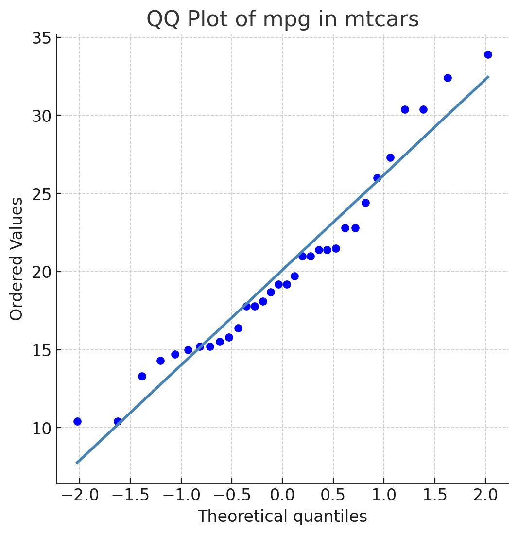
This line represents a perfect match between our sample quantiles and the theoretical normal quantiles. If our mpg data were perfectly normally distributed, all the points would fall exactly on this blue line.
Even with real, nearly normal data, you’ll see minor deviations—especially at the tails, where there are fewer data points.
Learning Python too? Pair your R skills with our Introduction to Python for Data Analytics. If you use R daily, you can also customize your R environment to streamline work.
Building intuition with simulated normal data
Let’s compare with truly normal data:
dfN1 <- rnorm(1000, mean = 50, sd = 10)
qqnorm(dfN1)
qqline(dfN1, col = "maroon4", lwd = 2)
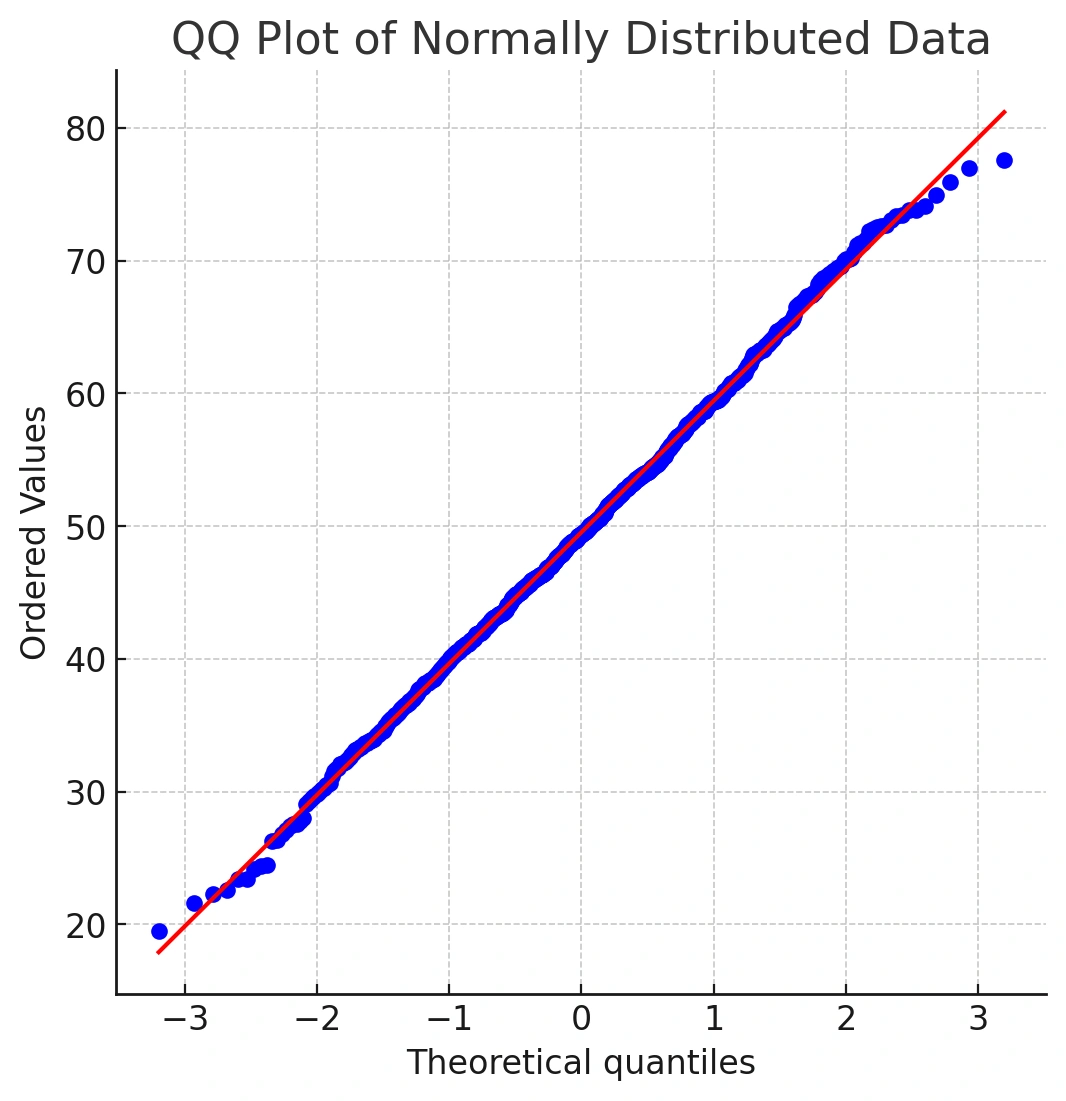
You’ll notice most points sit close to the line, with small deviations at the extremes. That’s expected noise at the tails.
Interpreting Deviations in a Q-Q Plot
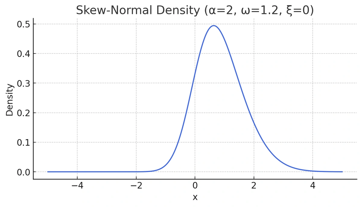
Now let’s generate intentionally skewed data using the sn package in R and examine its density.
library(sn)
x <- seq(-5, 5, length = 1000)
y3 <- dsn(x, xi = 0, omega = 1.2, alpha = 2)
plot(x, y3, type = "l", ylab = "density", col = "royalblue")
Deviations from the straight reference line tell a story about your data's distribution. A Q-Q plot clearly shows when data is not normal.
While this distribution doesn't look extremely different from a normal curve at first glance, its Q-Q plot reveals the true story. Let's take a look at the output of qqnorm() for this data:
qqnorm(y3)
qqline(y3, col = "dodgerblue4", lwd = 2)
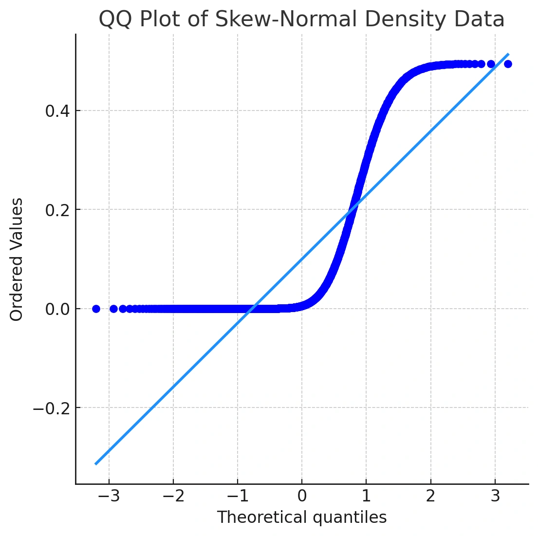
In the Q‑Q plot, the points curve away from the line in a concave pattern—classic right‑skewness. This is why a Q‑Q plot is a powerful normality test QQ plot: you see the problem, not just a p‑value.
Pattern cheat‑sheet for Q‑Q plot interpretation:
- Straight line (with small random noise): distribution aligns with the theoretical model (often normal).
- S‑shape: heavier or lighter tails than the reference distribution.
- Concave up (“smile”): right‑skewness.
- Concave down (“frown”): left‑skewness.
- Middle points off the line, tails on the line: issues in central tendency; potential outliers.
- Tails off the line: tail problems or extreme values.
Curious about complementary visuals in Python? See our Andrews curve plot in Python (blog) to compare distribution shapes across classes.
A True Q-Q Plot
Sometimes, you want to compare two empirical distributions directly, without assuming normality. The qqplot() function in R plots quantiles of one sample against another:
For example, we can compare two t-distributions with different degrees of freedom (df). A t-distribution with fewer degrees of freedom has heavier tails than one with more.
t20 <- rt(1000, df = 20)
t3 <- rt(1000, df = 3)
qqplot(t3, t20) abline(0, sd(t20) / sd(t3), col = "firebrick2")
qqplot()compares two datasets’ quantiles.abline()draws a reference line. Here, the S‑shape highlights heavier tails for df = 3 versus df = 20. Key: abline(intercept, slope)
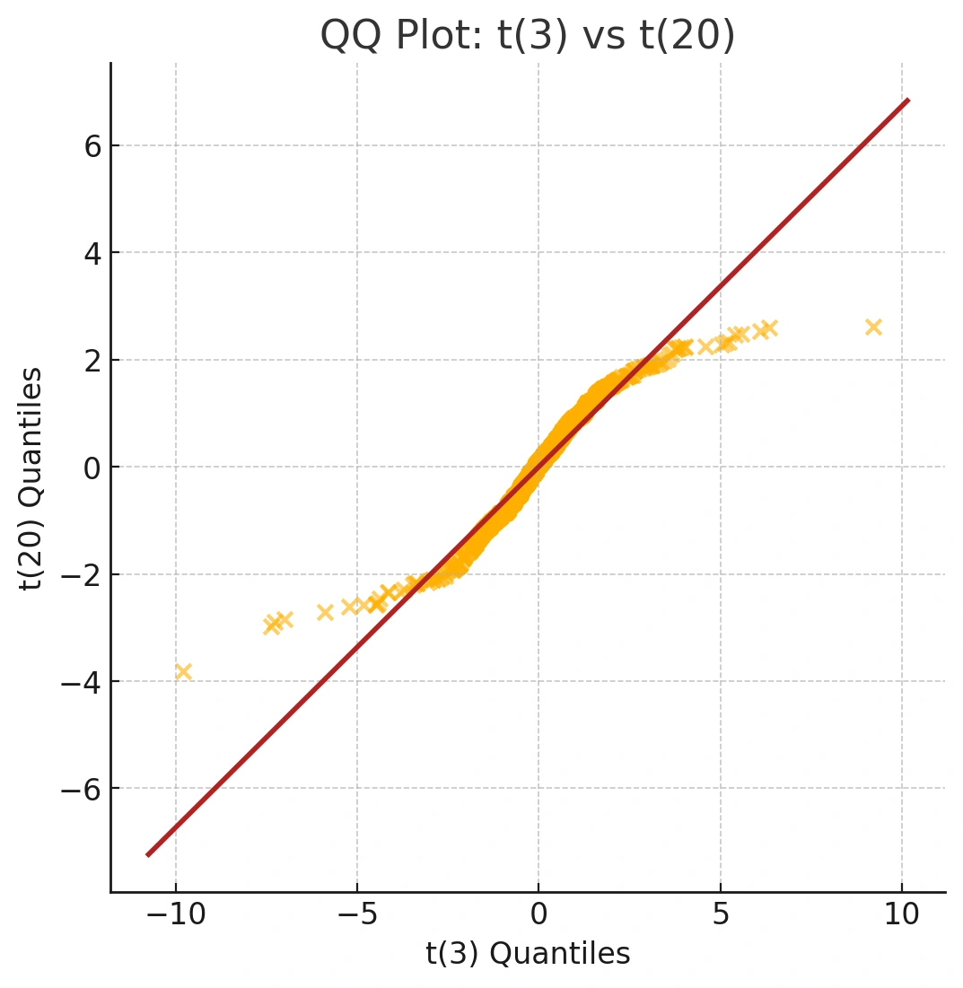
Unlike qqnorm(), there isn't a built-in line function for qqplot(). However, we can use abline() to draw a reference line. The resulting S-shaped curve visually confirms our knowledge that the t-distribution with 3 degrees of freedom has heavier tails than the one with 20.
If you’re building end‑to‑end workflows in notebooks, try our Beginning Data Science with Python and Jupyter.
Step‑by‑step: How to read a Q‑Q plot
- Identify the reference line: It represents a perfect match to the target distribution.
- Scan the center: Do most points track the line in the middle? That suggests the core of your data fits well.
- Check the tails: Look for systematic upward or downward bends at the ends.
- Spot patterns: S‑curves (tail issues), concave/convex curves (skew).
- Decide next steps: If assumptions are violated, consider transformations (e.g., log), robust methods, or non‑parametric models.
Keep building your skills
As you can see, well-chosen graphs communicate information more quickly and effectively than numbers alone. Q-Q plots are an indispensable tool for data exploration, helping you understand your data's distribution and validate the assumptions of your statistical models.
- Strengthen your statistical foundations with Learning Tree’s Fundamentals of Statistics for Data Science.
- Level up your Python skills in Introduction to Python for Data Analytics and our Data Visualization with Python Training.
- Ready for a structured, career‑boosting path? Explore the Python-Powered Data Science and AI Certificate Program.
Mastering these techniques is a key step in your data science journey. To gain the skills and confidence you need, explore Learning Tree’s comprehensive data science training, providing hands-on learning to help you achieve your career goals.
Frequently Asked Questions (FAQs)
What does a Q-Q plot tell you?
A Q-Q plot visually indicates how closely a dataset follows a specified theoretical distribution, such as the normal distribution. If the data points lie approximately along a straight line, it suggests the dataset fits the chosen distribution well.
Why are Q-Q plots used in data science?
In data science, Q-Q plots are used for diagnostic purposes. They help verify critical assumptions about data distributions, which is essential for the validity of statistical modeling, hypothesis testing, and machine learning algorithms.
How do you create a Q-Q plot in R?
In R, you can use the qqnorm() function to quickly generate a Q-Q plot that compares your data against a normal distribution. You can supplement this with qqline() to add a theoretical reference line for easier interpretation.
Can Q-Q plots be used for distributions other than normal?
Yes. While comparing against a normal distribution is most common, Q-Q plots are versatile. You can compare a dataset against any theoretical distribution (like exponential, uniform, or log-normal) or even against another dataset using the qqplot() function.
Is a Q‑Q plot a formal normality test?
It’s a diagnostic visualization. You can pair it with statistical tests, but Q‑Q plots show the nature of deviations, not just whether they exist.